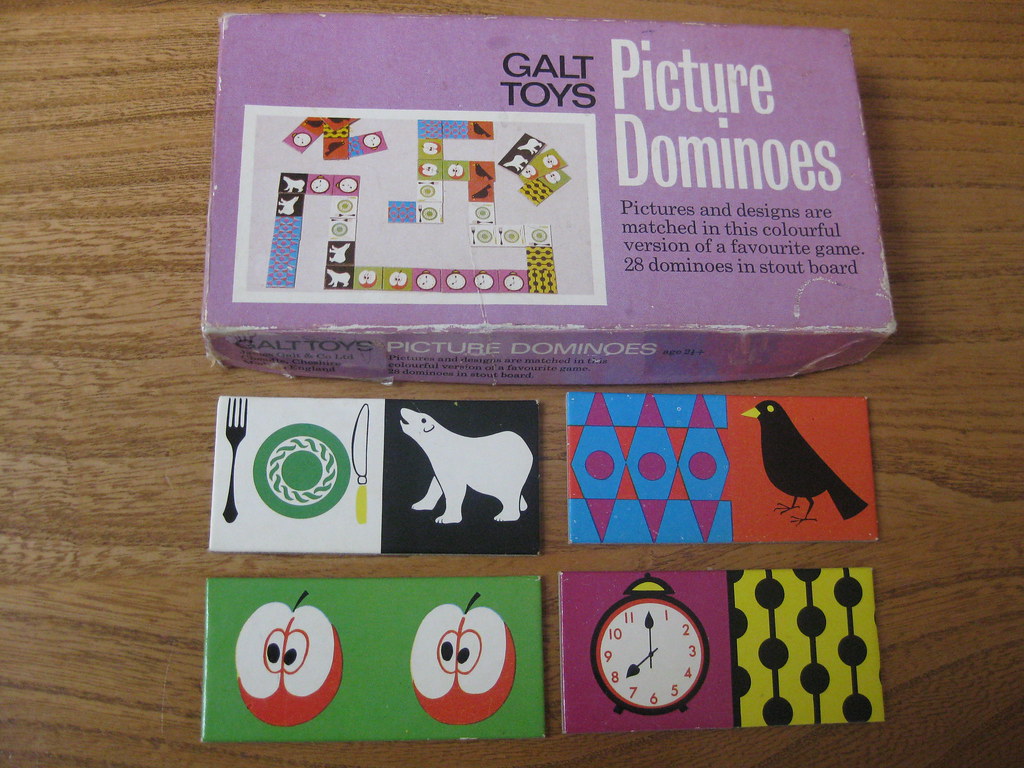
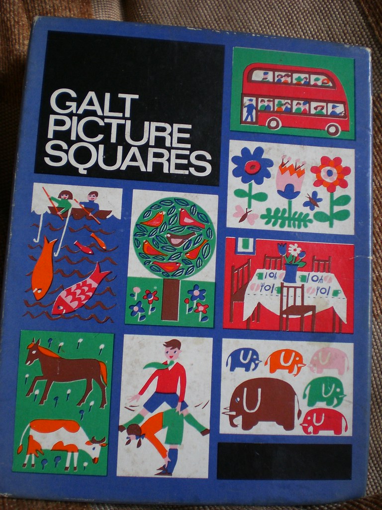
Designed by Ken Garland and Associates, 1961-1982 http://www.kengarland.co.uk/KGA%20graphic%20design/galt%20toys/index.html
"Although Galt's were an old-established firm (founded in 1836) and well known as educational suppliers, they didn't get into the retail toy trade until late 1961 when they opened their first toyshop at the top of Carnaby Street, with Verity & Beverley as architects and ourselves as graphic design consultants. We were brought in by Edward Newmark, with whom we had worked when he managed Paul and Marjorie Abbatt's toyshop in Wimpole Street. We had to build an image for Galt's virtually from scratch, and decided to base it on linking the company name at all times with the word 'Toys' which proved so successful that soon everyone was calling them 'Galt Toys' and ass uming that to be their real name. At first they were a little disconcerted by this but eventually accepted the inevitable. We enjoyed our work with them enormously, and for 20 years they were our most faithful and regular clients."
Other links to Galt designs